Keywords: {0}
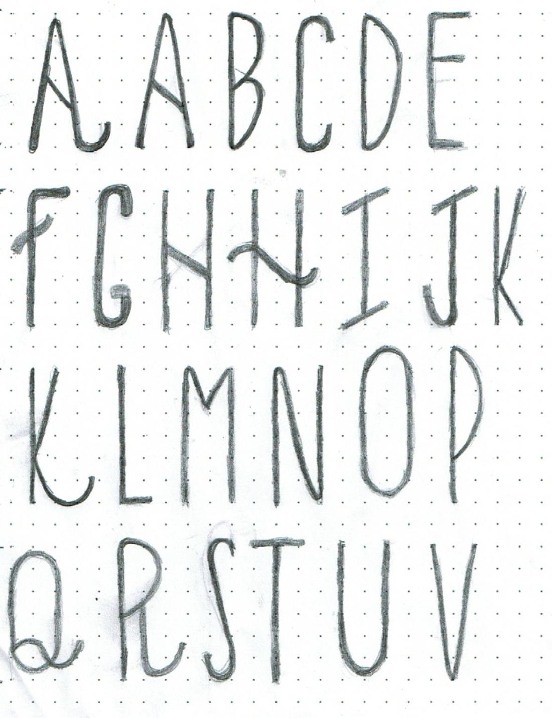
I went with the long and skinny theme for my typeface and the characteristic that I want my typeface to have is “playful, adventurous and youthful”.
https://beccadgsn.wordpress.com/2021/02/14/diy-typeface-mood-boarding-and-sketching
Keywords: {0}
I went with the long and skinny theme for my typeface and the characteristic that I want my typeface to have is “playful, adventurous and youthful”.
https://beccadgsn.wordpress.com/2021/02/14/diy-typeface-mood-boarding-and-sketching
To mark 3 years and the release of the book I will be giving away some prizes to followers. I want to make a Q & A session and I would love to include questions from yourself below.
about me , collage , draft , family , friends , graphic , love , ohio , photoshop
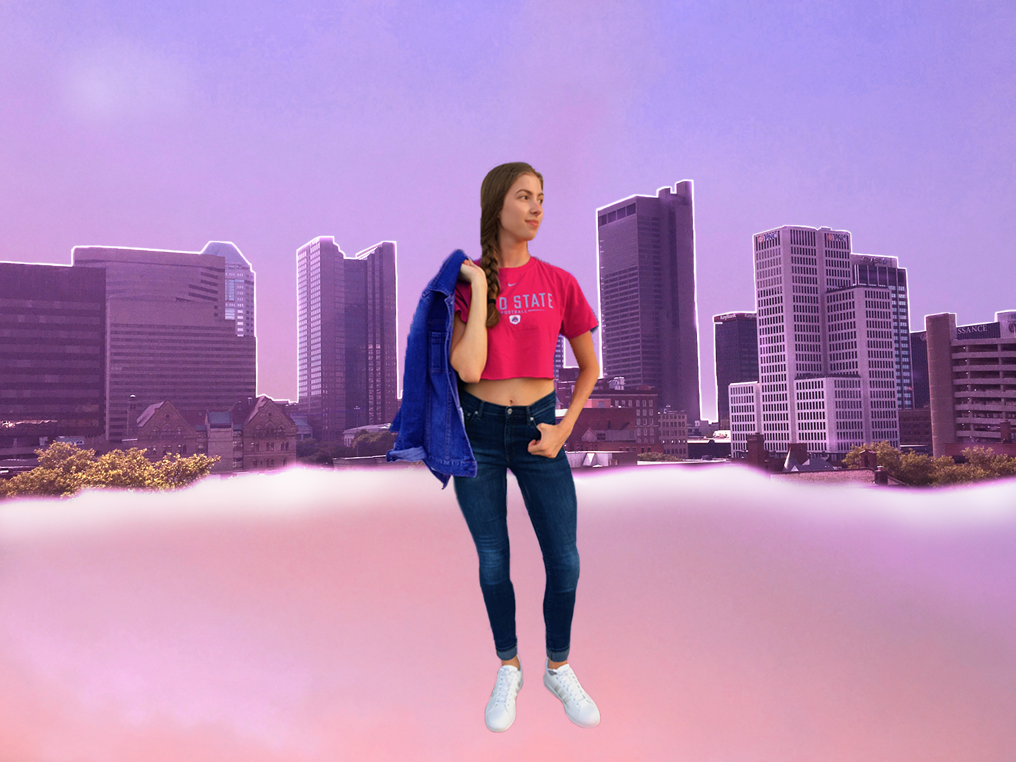
The creative process of this project began with the Photo Collection assignment. Gathering photo’s I might use in my collage got me thinking about photo’s I’ve taken that would really speak about my character.
Each element contributes to the overall narrative of this blog because it’s pieces of my life that make me who I am today, tomorrow and yesterday. The pink and purple sky is from a photo I took of a sunset at Kent State. The skyline is a photo I took on top of a parking garage in Columbus, my hometown, and the middle photo is of me in Maryland this past summer.
I created this collage by first drawing out the vision I had in my head, making sure to outline each photo I wished to use and and labeling what photo goes where so I didn’t get confused when I started the Photoshop process.
The…
View original post 56 more words
Animals, Black and White, Design, Graphic Design, Ideation, Logos, Mark Blaustein, Monochrome
Have you ever been exposed to a design and wondered just how the piece arrived at the conclusion that it did? The ideation process reveals the evolution of a piece, be it a logo, a website, a tool, and so on. The ideation process covers all initial ideas and any problem solving needed to reach a sound and resolved piece. Let’s look at the redesigned logo of The New York Public Library, by graphic designer Mark Blaustein.
 New York Public Library’s logo, Mark Blaustein, 2009
The image below shows the progress of distilling key elements in an initial sketch to create a solid icon. Mark Blaustein has recognised the economy of line and skilfully played it up to a logical conclusion.
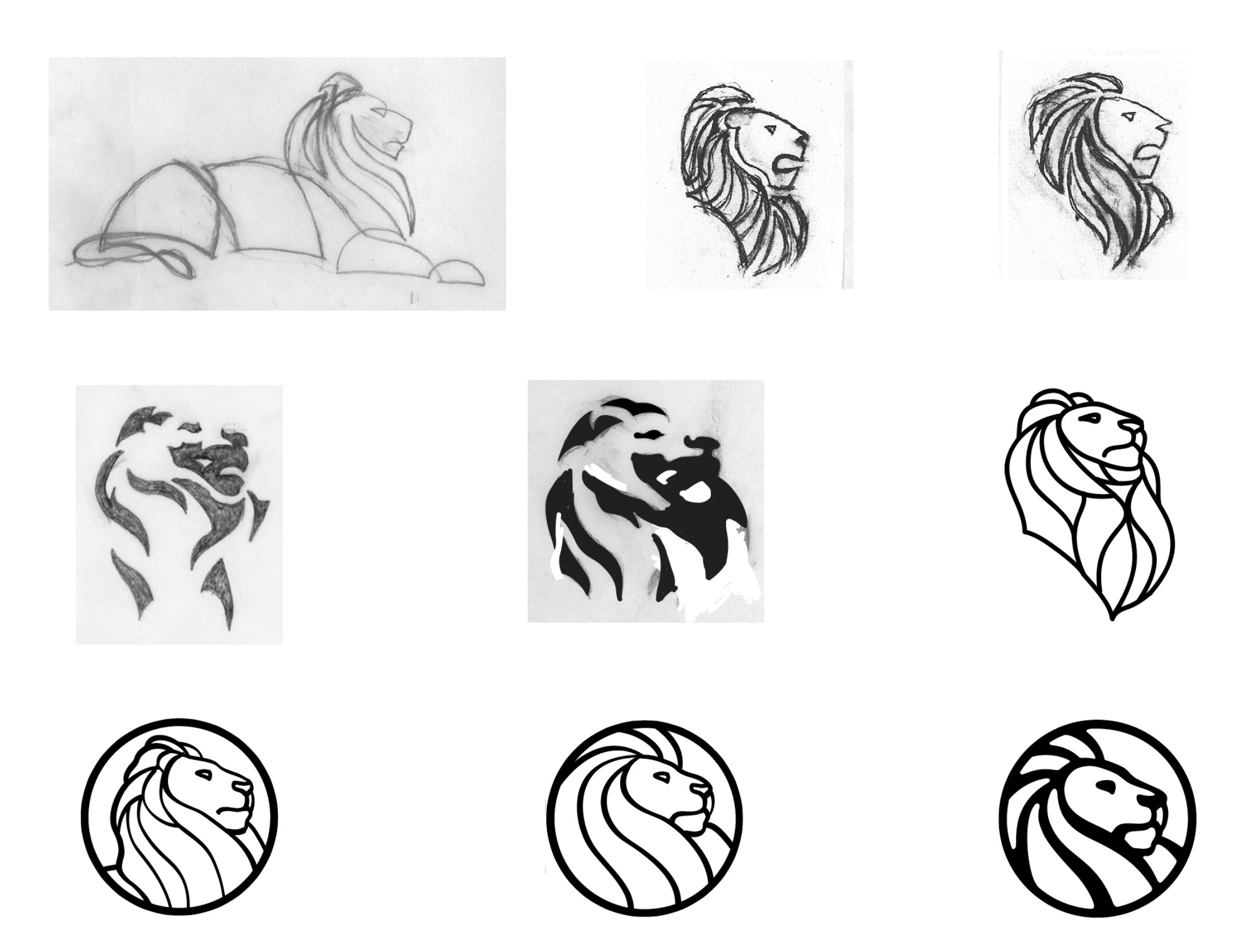 Marc Blaustein’s ideation process of creating a new logo for The New York Public Library, 2009
Of course, the (sometimes arduous) process of logo ideation is a lot messier than clean…
View original post 477 more words
art, art professor, design, drawing assignment, drawing shapes and texture, John Foster Dyess, painting of Vegetables, St. Louis Community Collage at Meramec, still life painting, student-art, teaching-art, tomatoes and peppers painting
Journal of Seeing by John Dyess
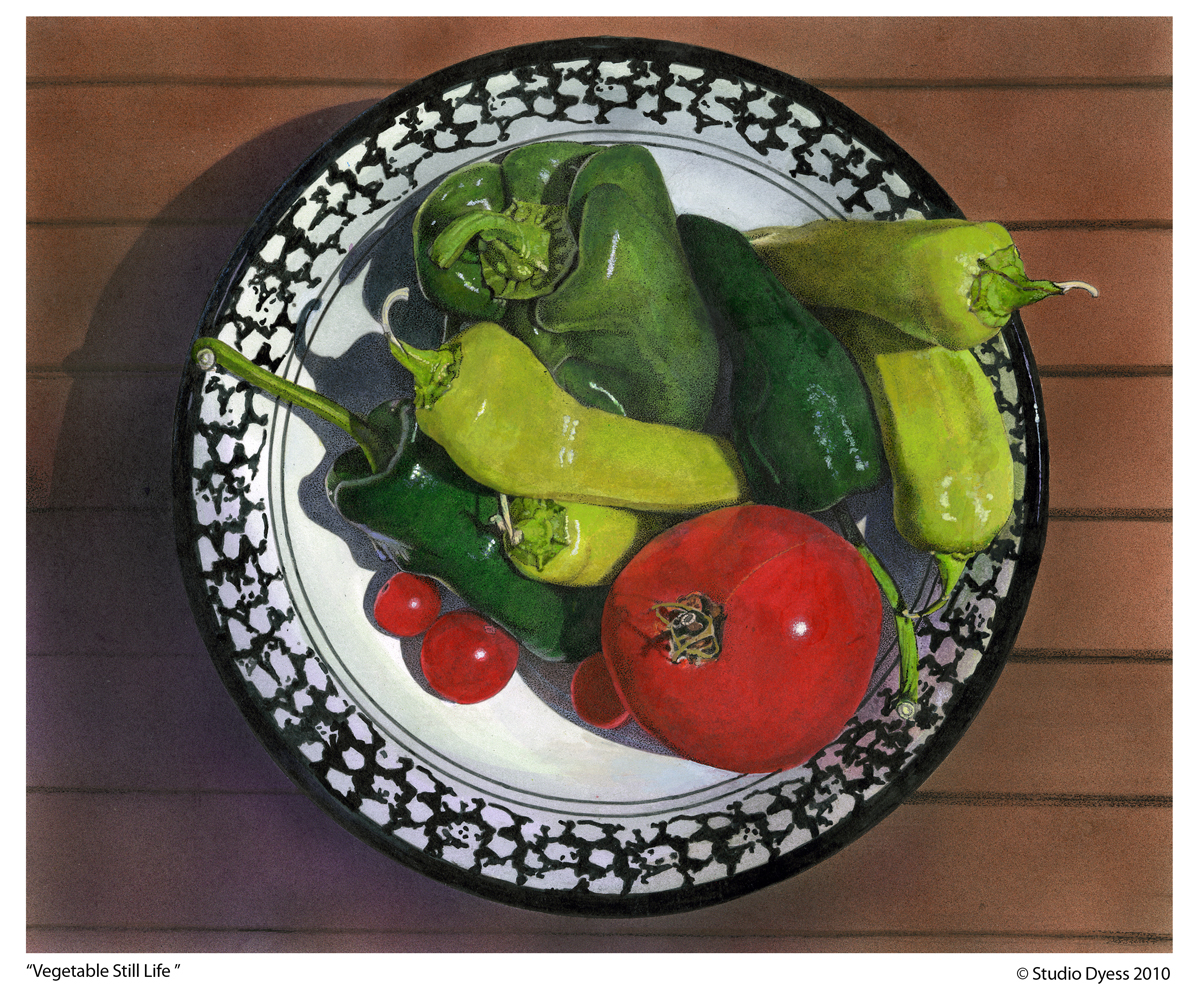 This is another “birds eye view” of a still life that I created in ink and liquid acrylic paint in 2010.
I have been an adjunct professor teaching art at St. Louis Community College at Meramec since 1997.
A class I teach is “Drawing for Graphics” ,which I call drawing ideas for graphic design. It was the first class that I taught at Meramec and since 1997 I have changed the assignments many times.
One of my early assignments in this class was titled “Drawing textures and shapes. One part of this assignment was to draw four rectangle shapes
4″ wide x 2” high and within those rectangle shapes draw a square, triangle, rectangle and circle. The students were to overlap shapes to create foreground, middle ground and background. They were to draw within the shapes texture and tone to create depth. Below is one of the best solutions to…
View original post 13 more words
